February 8th, 2024
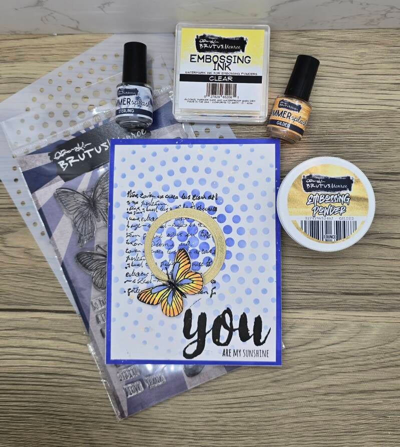
Hello, and welcome to my blog! This is my first post since being chosen to be an inspiration team member for Brutus Monroe. I couldn't be more excited! I love Brutus Monroe products and will enjoy sharing my work using their items! I was feeling some mixed media vibes when I created this card. I love geometric shapes and butterflies. I thought the contrast between the two added interest to my piece. The sentiment is perfect because I'm giving this card to my husband, who is my sunshine.
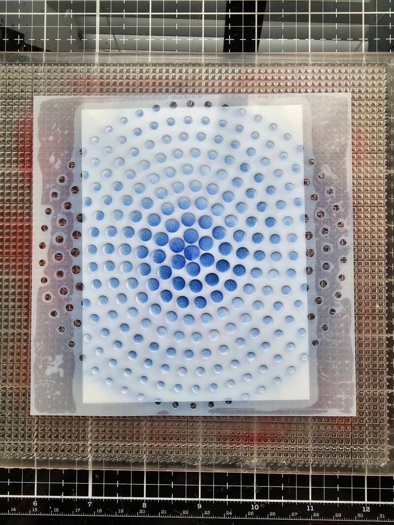
I started my card by stenciling the cardstock panel with Blueprint Distress Ink on top of Brutus Monroe's Circle Tone Mixed Media Stencil. I inked darker in the center, then faded to pale blue around the edges. Pro Tip: When stenciling, apply ink in a circular motion, going both clockwise and counterclockwise. This adds depth to the image and you will get even the most detailed stencils image transferred.
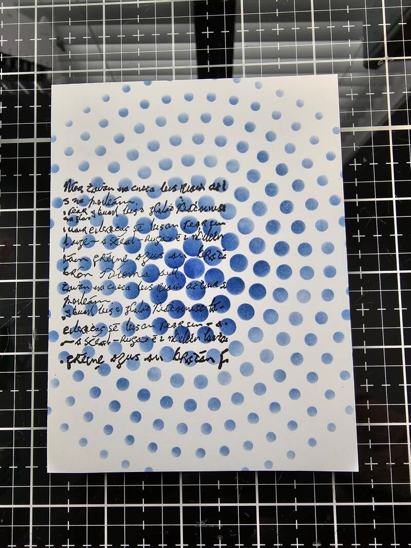
I used a script background stamp from my stash. By being offset, it helps draw the eye towards the butterfly, which is the focal point of the card. Layering the stamp on top of the stenciled image gives texture.
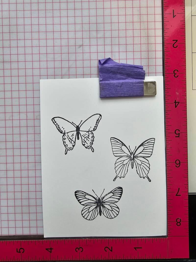
I stamped all three butterflies from Butterfly Sentiment Stamp Set, but only ended up using one. I wanted a single focal point to keep this card as clean and simple as possible, but I think it would look lovely with all of them.
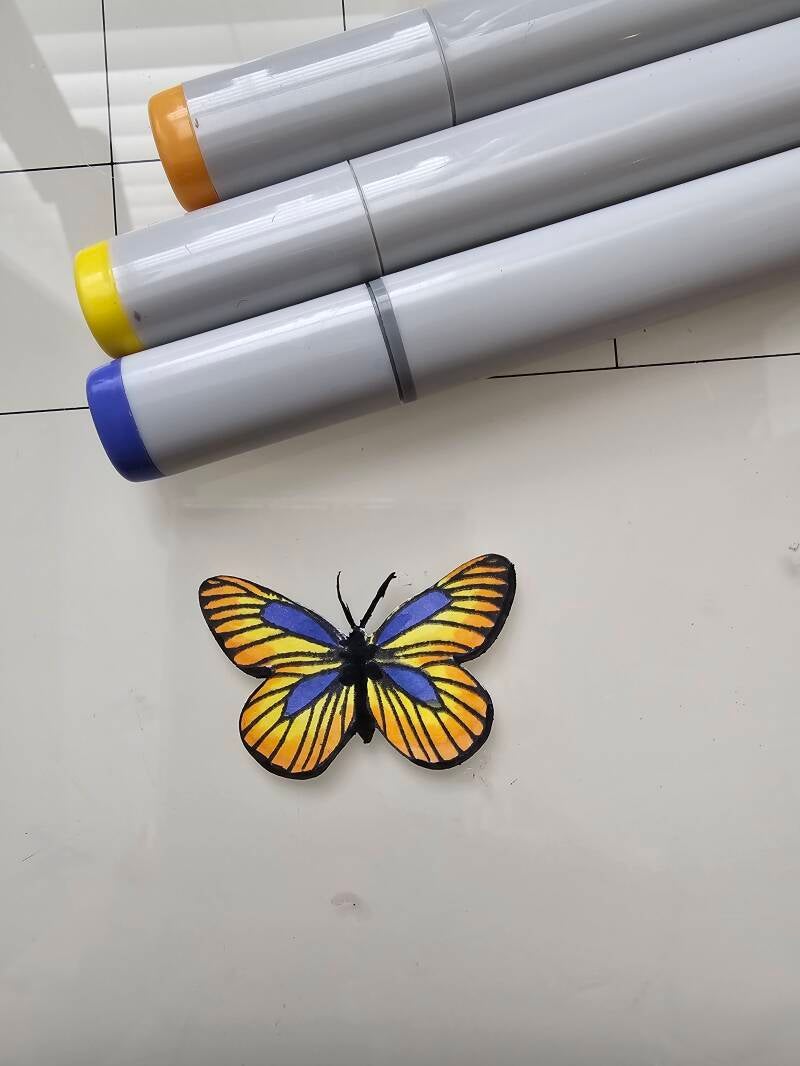
I colored this beautiful butterfly with B63, BV13, YR12, and Y13 Copic markers. I chose blues that closely matched Blueprint Sketch and yellows because they are complimentary to the blue.

I created this ring by taking two circle dies and cutting out together from white cardstock. Then, I applied clear embossing ink and Brutus Monroe's Gilded embossing powder (my favorite gold!) before heating it. This is a great hack to create cardstock the exact color and shine you want.

Another way to make the color cardstock you need, is by applying ink directly to your paper. This is the same color ink I used on the stencil. I only needed the outside edges blue, so I just applied the Distress Ink the the edges of an A2 cardstock panel.

The finished product! After putting the top panel on, it looks like it is on top of an entire piece of blue cardstock. Also, I added Glossy Accents to the butterfly body and Shimmer Splash to the wings. There's a lot of shine and texture. To tie in the gold, I splattered the entire card with Gilded Shimmer Splash. Then, I stamped the sentiment. I'm really enjoying working with Brutus Monroe products that I haven't used in the past!